


The key art for TOEM 2
On making 'capsule art' for Steam and current progress on Bibidi Bibidi...

Hallå pals!
Jonas here with another issue of Indie Notebook to get some ideas out of my noggin, and to inspire you to do the same.
I’ve been in the thick of drawing backgrounds for Bibidi Bibidi these last two weeks. It’s slow going, possibly because there are so many details, and I probably put a bit too much effort into the sketches.
I can cram out like 8-10 usable monster sketches in a day. So I was quite shocked by how much longer it took to draw these backgrounds. I’m gonna have to sort of redo the whole image at some point with proper line art and a lot of the coloring with it. It would have been smarter to go rougher at this stage but we’re putting the Steam page live soon and it kinda needs to look cool right away, so I’m categorizing that step as ‘polish’ instead.
Let’s talk about something completely different for the rest of this newsletter now!
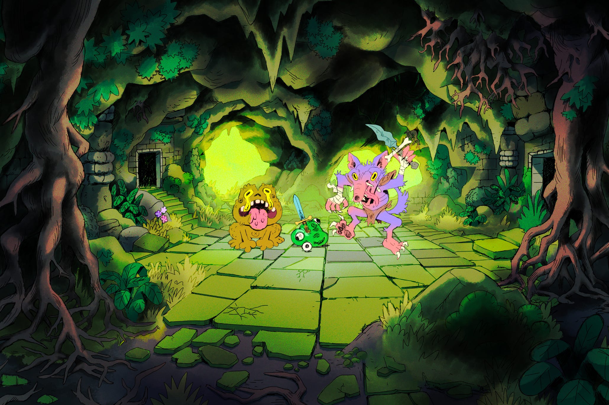
Making the key art for TOEM 2
One of my main streams of income is through doing cover illustrations for video games (I call this ‘key art,’ a lot of people call it ‘capsule art,’ but I find that limiting, I’m saving this rant for another post). One of the first key arts I got commissioned to do was for TOEM. In it you go on a photo adventure in a quirky Scandinavian world.

It has already been 4 years since this game came out. It was very well received by the public and critics. Well enough so they’re making a sequel!
They’re really pushing the quality to a whole other level this time. To be honest I didn’t think they would come to me again for another illustration cause they had made such leaps, I didn’t know if I could keep up. But luckily they asked me, and I got the opportunity to see whether I had improved since 4 years ago.
So they shared some references and let me try their current demo. I think they wanted to make it more clear this time that this is about photography. And the tone of the sequel is a bit brighter.
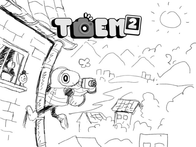
The first step when I make an illustration like this is to spend some time considering all the possibilities with some rough sketches.

They shared a few references of what they liked, this key art from Super Mario Wonder really stood out to me.
This is the first thing which came to mind. I draw these very loosely because it is really just about the idea at this point.
In the first game the movement was nice, but kinda simple. But in the sequel you can climb around on nearly everything, it feels like parkour. So I wanted to explore that too.
The composition of this one is quite reminiscent of that one picture of Link scaling a cliff in Breath of The Wild.

I’m also a fan of the fish-eye lens effect (who isn’t), I haven’t gotten to do an illustration using it yet so I gave that a shot too.
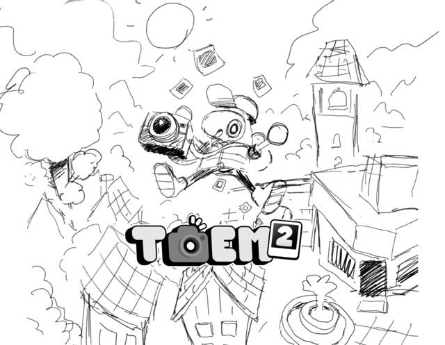
Then I felt the urge to try another variation of the first sketch. Because why not?
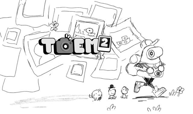
I shared all these ideas with them in one go. They said they liked all of them, but they ultimately landed on idea #1. I think that was a good pick. What I like about it aside from the composition is how it allows us to show many things from the game very efficiently.
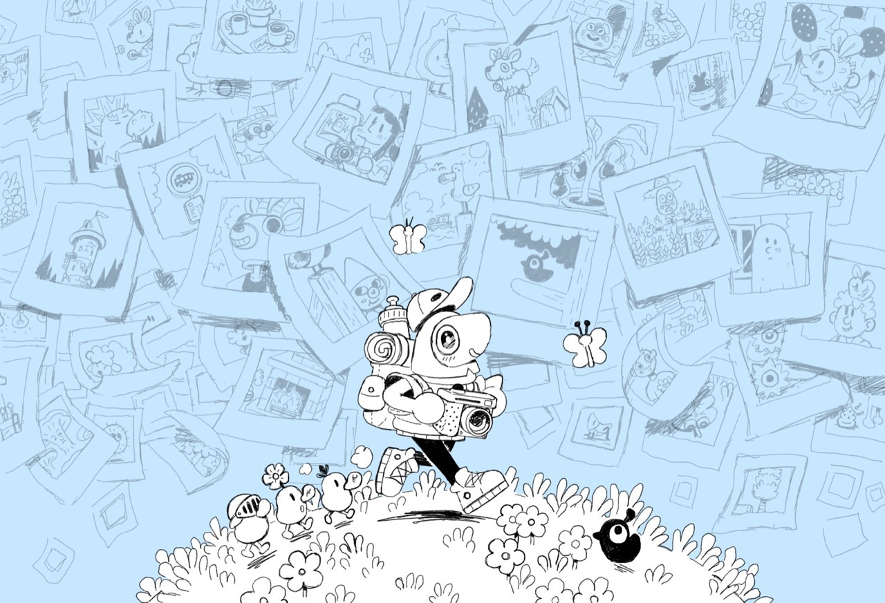
So I refined the sketch and took the time to fill in all the polaroids. That took a while.
I also always separate key arts into separate layers for each element in the picture. For this one I split the background with the photos into one layer, the butterflies into one, and the foreground with the characters into another. This is to make it easy to configure all the different graphics Steam ask for (there are a lot of them). For this reason we also decided it would be a good idea to expand the borders of the image so I could draw the polaroids completely. To make it easier to move them around without them being cut off.
Then I did the line art. This is often the scariest stage for me because it often looks so messy and unflattering. And it’s at this point where it becomes clear to me just how much work there will be with coloring. The lines here are very noisy in my opinion, which means I will have to work quite a lot to make the image easy to read.
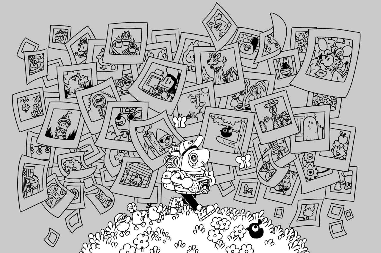
Normally I would call this step “coloring,” but I don’t know if that’s the right word for it when there are no colors. Once I’ve filled in all the flat colors, I start rendering the image with shadows, highlights and fog. I also color the lines themselves. My rule for that is; each separate object has a fully black outline and interior lines are brighter. This is maybe my favorite step, it’s just plain meditative and easy. I think it’s always worth the extra time because it becomes a lot easier for the eye to look at the image.

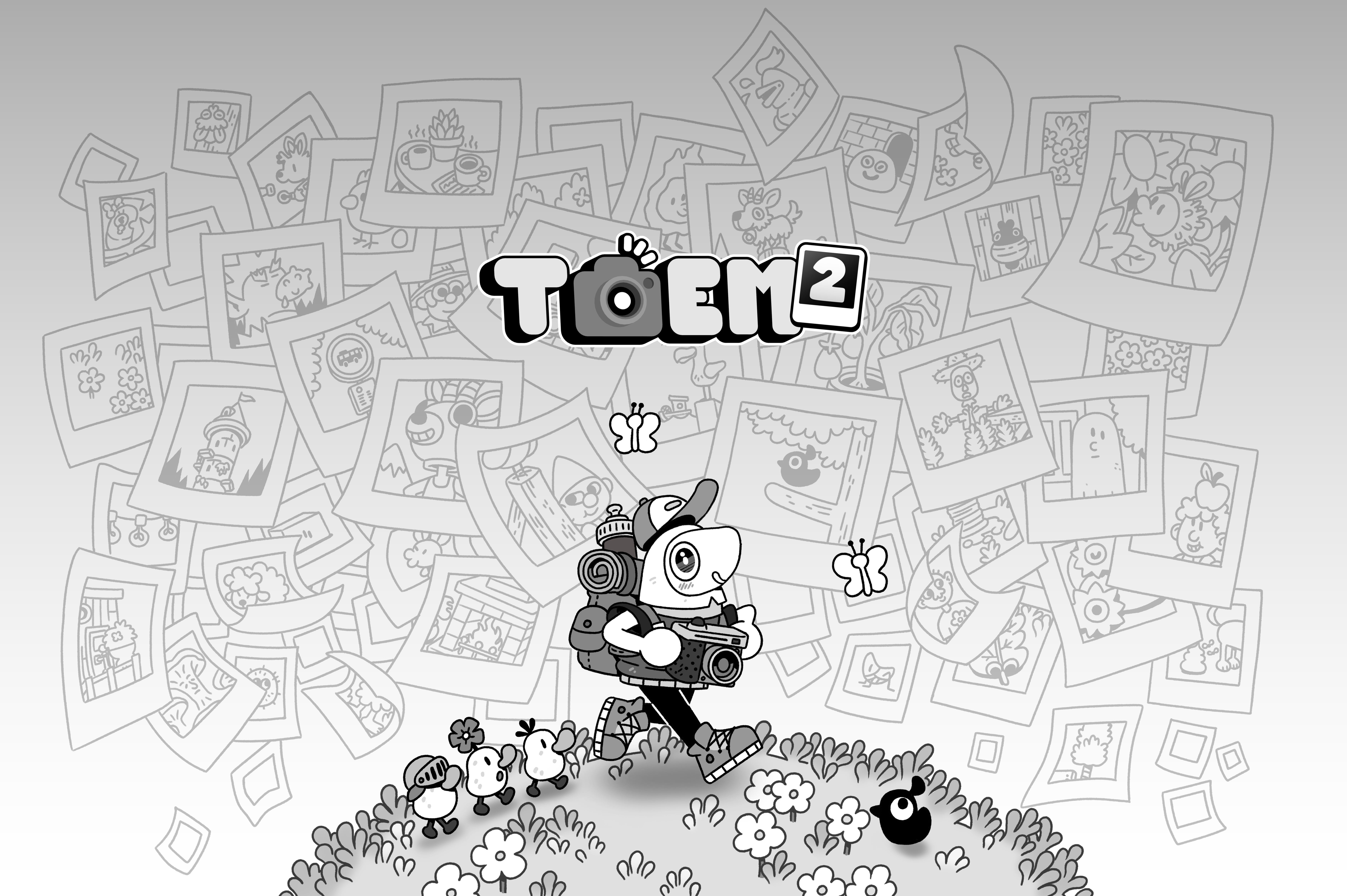
This is what the final key art looks like! It might be hard to tell but I added some noise texture on top of it (I always do), to me any art feels kinda unfinished without it. I find cartoony pictures with mostly flat colors just look a bit too perfect without it.
I feel quite proud by the progress I’ve made since that first TOEM illustration I made. It looks so much more tight, polished and confident.
I’ve already mentioned it but the same goes for Something We Made, they’ve made incredible leaps between these two games. The love and care this little team is pouring into this game is mind blowing! I hope they are at least as proud of TOEM 2 as I am of this illustration.
Go have a look at TOEM 2 on Steam and wishlist it!
Mini Notes
📚 Book - The Almanack of Naval Ravikant
This is a collection of thoughts by an entrepreneur about wealth and happiness. I never really considered wealth to be anything else than money.
This book has sold more than one million copies but they give it away for free in all digital formats on their official website. Which I find quite amazing.
I’ve only read about 25% of it so far but it’s been quite inspiring and interesting. If you’re looking for something to read I’d say at least pick it up and skim through it to see if anything picks your interest.
📚 Book - The Postmortal
One of the best books I’ve read in a long time.
The premise of this book is that humanity invents a vaccine for aging and so everyone can live basically forever. They can still die of natural causes like disease and wounds, it’s just that their bodies don’t age. The story is told through journal entries by the main character, so it feels very believable and relatable. Each journal entry is quite short, so it’s very easy to read.
I read his other book The Hike before this one, which is also great.
📝 Blog post - Making video games in 2025 (without an engine)
After making a game for the Playdate (Long Puppy) I find it somewhat overwhelming to work in editors like Unity and Godot. Especially the Godot interface feels so clunky. Now I'm tempted to transition to something like Love2D so I can mostly deal with scripts and files.
This blog post makes a great case for trying a framework instead of an engine.
Thank you for reading Indie Notebook! I’d love to hear what today’s issue made you think about.
Take care and have a creative week.
Pretty ! I think Space Deer grew you!
That's a beautiful piece of key art!